
- CSS Sorcery: 3D Text Hover Effects Without (Real) JavaScript
- 1. How the 3D-Card Effect Works
- 2. My Idea
- 3. The Implementation
- The React Part: The Trojan Horse
- The CSS: Where the Magic Happens
- 1. Type Safety in CSS? @property
- 2. The Grid as a Controller
- 3. The :has() Selector – The Parent Spy
- 4. Math Class (Trigonometry in calc())
- The End
CSS Sorcery: 3D Text Hover Effects Without (Real) JavaScript
Picture this: It's Christmas, I'm on my way to visit the family, staring out the window, and suddenly a thought pops into my head. I wanted to build a 3D hover effect for text. You know, something where a multi-colored drop shadow appears behind the text, and the whole thing looks like you're physically dragging the letters around.
If you know me or follow my ramblings, you know I’ve recently fallen head over heels for Daisy. DaisyUI, to be precise. DaisyUI recently introduced a 3D Card component, and they did the whole thing entirely in CSS.
Now, I could give you a long-winded lecture on why I will always choose CSS over JavaScript given the chance, and why that’s exactly why I love DaisyUI so much... but that’s not what we're here for today.
First, let's quickly break down how DaisyUI solved the card hover effect using only CSS.
1. How the 3D-Card Effect Works
Unlike JavaScript, CSS can't simply grab the X and Y coordinates of your cursor. So, we need a creative hack. Specifically, we need a Grid where every cell acts as a sort of coordinate trigger for the image.
Imagine a 3x3 grid:
- Top Left = A1
- Top Center = A2
- Top Right = A3
- ...and so on, down to Bottom Right = C3.
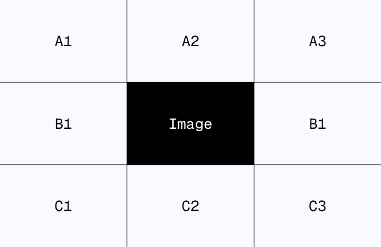
When you hover over one of these invisible grid areas, it triggers the 3D animation in a specific direction. Combine that with a strong CSS transition, and the user barely notices that it’s not pixel-perfect tracking, but rather coarse zones triggering the movement. It’s basically like those dance dance revolution pads from the 80s, but for your mouse.
And that’s really it. The image scales and rotates three-dimensionally depending on which "platform" (grid cell) is being hovered.
2. My Idea
My idea was basically to reverse-engineer this and apply it to typography. I wanted the text to consist of three layers that follow the mouse circularly on different radii.
3. The Implementation
Ever since I moved my projects over to Netlify, I’ve been using Deno for little experiments like this. Deno is insanely fast, supports TypeScript by default, and allows me to just use my familiar NPM packages. So, I fired up Vite with React, and I was ready to roll.
Vite comes with PostCSS, which supports CSS-Modules, allowing us to create component-specific styles without the headache of global namespace pollution.
I stripped the default elements out of the React App component, and off we went.
Buckle up, folks. We are diving deep into the world of @property, native nesting, and oklch colors.
The React Part: The Trojan Horse
Let’s look at the JavaScript code first. It looks suspiciously harmless.
TypeScript
export default function FancyTitle({ title }: { title: string }) {
  return (
    <div className={styles.container}>
      <h1 data-title={title} tabIndex={0}>{title}</h1>
      {/* Here starts the madness... */}
      <div tabIndex={0} />
      <div tabIndex={0} />
      <div tabIndex={0} />
      <div tabIndex={0} />
      <div tabIndex={0} />
      <div tabIndex={0} />
      <div tabIndex={0} />
      <div tabIndex={0} />
    </div >
  )
}
"Wait a minute," I hear you ask. "Why on earth are we rendering eight empty divs?"
That, my friends, is Spatial Awareness without JavaScript. These empty divs aren't layout bugs; they are sensors. We are building an invisible 3x3 grid here. The title sits in the middle (spanning across the layers), and the empty divs surround it to detect where the mouse (or focus) is coming from.
A clever trick: By adding tabIndex={0}, the whole thing becomes keyboard accessible. Accessibility win! (Well, technically speaking, at least).
The CSS: Where the Magic Happens
This is where we switch to modern CSS. No preprocessors, no SASS—we are using Native CSS Nesting, and it looks incredibly clean.
1. Type Safety in CSS? @property
Before we style anything, we define our variables. But we don’t just define them loosely. We give them types.
CSS
@property --angle {
  syntax: "<angle>";
  inherits: false;
  initial-value: 0deg;
}

@property --radius {
  syntax: "<length>"; /* Type safety FTW! */
  inherits: false;
  initial-value: 0rem;
}
Why the effort? Because now the browser knows that --angle is an actual angle. This means it can interpolate it. When we change this value, it doesn't just snap to the new number; it animates smoothly between them. This is the difference between "glitchy" and "butter-smooth."
2. The Grid as a Controller
The .container spans a 3x3 grid. This is where it gets interesting:
CSS
.container {
  display: grid;
  grid-template-columns: repeat(3, 1fr);
  grid-template-rows: repeat(3, 1fr);
  /* ...oklch colors for the hipster factor... */
}
The h1 takes up the entire space (grid-area: 1/1/4/4), sitting on top of everything. The empty divs (our sensors) are placed precisely into the surrounding cells (e.g., :nth-child(2) goes to the top left) using CSS grid placement rules further down the file.
3. The :has() Selector – The Parent Spy
Here comes the feature we’ve been waiting years for. We style the h1 based on which sibling element is currently being hovered. Since CSS (Cascading Style Sheets) usually only looks down, we use :has() on the container to check the state of the children and then style other children accordingly.
Look at this block. This is pure logic inside a stylesheet:
CSS
/** Grid area A1 (Top Left) **/
&:has(:nth-child(2):hover) h1,
&:has(:nth-child(2):focus-visible) h1 {
  --angle: -45deg;
  --radius: 1rem;
  /* ... nested styles for pseudo-elements ... */
}
Translation: "If the container has a second child (the sensor div at top-left), and that child is hovered or focused, then set the angle to -45 degrees."
We repeat this for all 8 compass directions. We are mapping mouse positions to angles without a single JavaScript event listener. Genius? Yes. Crazy? Absolutely.
4. Math Class (Trigonometry in calc())
Now that we have the angle and radius, we move the text. But we don't just move it. We split it.
The h1 uses ::before and ::after pseudo-elements that contain the same text (content: attr(data-title)).
When the hover state is active, this happens:
CSS
transform: translate(
    calc(cos(180deg + var(--angle)) * var(--radius)),
    calc(sin(180deg + var(--angle)) * var(--radius) * -1)
);
Remember the unit circle from high school math? No? Well, your browser remembers.
We use sin() and cos() to calculate the exact X and Y coordinates based on the angle (--angle) and the distance (--radius).
The End
Now we made all of this you can now see the result here
And also on GitHub
This my dear friend is it for today. Was fun to do this little effect. Feel free to try it out by your self with something different. If you don't want to miss any following posts, follow my RSS-Feed.
If you have any questions, write me an E-Mail:
kontakt@janwalenda.de