- 🎨 CSS Magic with @starting-style: The Unsung Hero of Animations
- The Setup: Modern Tooling Meets Vanilla CSS Power
- The Button: Type-Safe and Stylish
- The Modal and @starting-style
- What exactly is going on here?
🎨 CSS Magic with @starting-style: The Unsung Hero of Animations
A Blog Post from Your Dev Blogger Who Finally Solved Their display: none Issues
Hello Frontend Community,
You know the feeling, right? You want a cool, smooth entry animation—an element should gently swoop in—but instead, it just snaps into existence. This usually happens because it was previously hidden with the harsh display: none rule. Standard CSS transitions simply fail here. It's always been that annoying grain of sand in the otherwise smooth-running CSS engine.
But wait! The days of wrestling with setTimeout and manually adding classes just to define an initial state for an animation are over! The solution is: @starting-style.
The Setup: Modern Tooling Meets Vanilla CSS Power
Before we dive into the CSS gold, a quick look at the stack. We're working within a solid Deno + React + TypeScript + Vite environment.
For styling, you've chosen a combination that I personally love:
- CSS Modules: Keeping those class names nicely scoped.
- CVA (Class Variance Authority): Because we adore variants (especially for Buttons).
- Native HTML Elements: <dialog> instead of a thousand lines of div soup.
The Button: Type-Safe and Stylish
In your project, you've built a Button using cva. This is great because it lets us define variants like ghost, outline, or circle without cluttering the component code.
// An excerpt from your Button Component
const button = cva(styles.button, {
  variants: {
    variant: {
      default: styles.button,
      outline: styles.buttonOutline,
      circle: styles.buttonCircle,
      ghost: styles.buttonGhost, // Perfect for the Modal's close button!
    },
  },
  defaultVariants: {
    variant: "default",
  },
})
That's clean, that's maintainable. But let's move on to the actual star of the show.
The Modal and @starting-style
This is where it gets exciting. A native <dialog> element is hidden by default using display: none. When we call showModal(), the browser switches it to display: block (or flex, as in your case) and moves the element to the "Top Layer."
Normally, this happens instantly, with no transition. Why? Because the browser has no "before" state to interpolate from when the element wasn't rendered at all before.
Here is your code in action:
/* The "closed" state (actually invisible) */
.modal {
  display: none;
  opacity: 0;
  transition: opacity 0.2s ease-in-out,
              translate 0.2s ease-in-out,
              scale 0.2s ease-in-out;
}

/* The "open" state */
.modal[open] {
  display: flex;
  opacity: 1;
  scale: 1;
  translate: 0 0;

  /* THIS IS WHERE THE MAGIC HAPPENS */
  @starting-style {
    opacity: 0;
    scale: .98;
    translate: 0 20px;
    /* You also included backdrop-filter and background-color here! */
    background-color: oklch(from #ffffff l c h / 0.3);
    backdrop-filter: blur(5px);
  }
}
What exactly is going on here?
The element receives the open attribute.
The browser sees: "Aha, I need to display this."
Thanks to @starting-style, the browser now knows: "Okay, for the very first frame where this element exists, I will pretend it has opacity: 0 and is slightly translated downwards (translate: 0 20px)."
In the next frame, the regular styles of .modal[open] take effect (opacity: 1, translate: 0 0).
The transition property kicks in and animates between these two states.
This also works brilliantly for transitioning from the low-blur backdrop-filter (5px) defined in @starting-style to the final state (15px) defined in .modal[open].
The result? The modal doesn't just "pop" up; it softly fades in and glides slightly upward. Silky smooth! 🧈
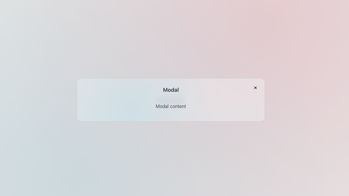
Here the final result:
Happy Coding! 🚀